Synoptic Weather Maps – What They Are And How To Use Them
Synoptic Weather Maps - What They Are And How To Use Them
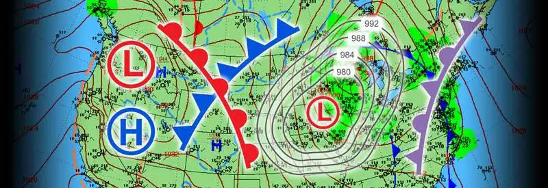
While watching a weather forecast, you often see a map covered with symbols, lines, and colors being used. Meteorologists use these synoptic weather maps to illustrate current and future conditions.
But what do all those lines, symbols, and colors mean? And how does the weather map help you get a better understanding of the weather forecast?
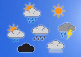 In a previous article, we covered all the symbols and accompanying information to help you fully understand what the prominent forecasting symbols mean. (You can read the in-depth article here.)
To complete the picture, however, I want to help you get a better understanding of the weather maps used in forecasts as well. By understanding a weather map, you will get a much better idea of what to expect and why.
This is also meant to help those of you who own or plan on buying a home weather station in the future to better understand a weather map and use your device more effectively.
Understanding how to use a weather map effectively will assist you in making better sense of your weather station’s readings and how they correlate with indicators on the map.
Before we start examining the different elements that make up a weather chart in detail, we need to clarify what a weather map is:
What Is A Synoptic Weather Map?
Before we start looking at the different elements that make up a weather map and their purpose, we first need to define what exactly a weather map is:
Synoptic Weather Map Definition
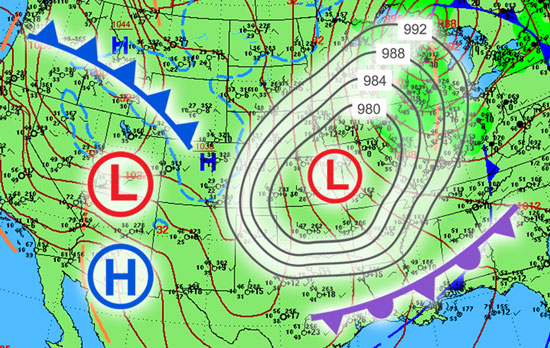
A synoptic weather map is primarily used to display atmospheric conditions and weather patterns across a specific region at a particular point in time. Symbols and additional graphical elements representing different weather conditions and events are overlaid on the map and are typically used during meteorological forecasts.
In recent years, advances in animation and display technology have enabled weather forecasters not only to display current atmospheric conditions but also to illustrate how these conditions are expected to develop in future forecasts.
It is important to understand the difference between a chart showing current conditions and the modern graphical equivalent of a forecast showing an impressive and realistic animated prediction of how the weather might react in the future.
The former is an accurate portrayal of current conditions, while the latter is a part of the prediction/forecast and should not be taken as fact.
Weather Map Symbols And Elements
The various symbols, icons, and elements on a weather chart represent some form of weather condition or event. Knowing what each of these elements symbolizes will help you understand the different kinds of atmospheric conditions that are present on the map.
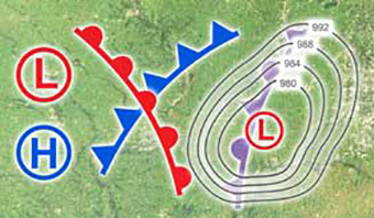 Knowing what each element on a map means will help you to read better and understand the weather map, as well as better follow the actual forecast. (You may even draw your own conclusions as to what to expect, based on your personal experience and level of expertise).
Each element will be described and explained, along with what it represents. Where possible, I will provide a link to a separate article that offers detailed information about the condition or event represented by the element or symbol. (Should you like to learn more about the weather occurrence and its implications).
The best way to proceed is to start with the most commonly used elements and move to the lesser-known ones in the latter part of the section.
On almost any weather map, the majority of weather systems are formed around two areas:

Low-Pressure System
A low-pressure system is an area where the air (barometric) pressure is significantly lower than that of the surrounding air. As air always flows from an area of high to low pressure, winds are drawn towards this system.
In the Northern Hemisphere, air circulates counterclockwise around a low-pressure system, and in the Southern Hemisphere, it flows clockwise around it. You can find out more about the development and characteristics of a low-pressure system in this article.
A low-pressure system is the source of a variety of weather systems forming around it. This can vary from cold fronts to more severe weather systems.
Some strong low-pressure systems in the sub-tropics can lead to tropical depressions, which, in turn, can lead to much stronger storm systems. You can read exactly how these storms are formed in this article.

High-Pressure System
A high-pressure system is an area where the air (barometric) pressure is higher than that of the surrounding air. In this case, air usually flows away from the center of this system for the same reason it flows towards a low-pressure system.
You can find out more about the development and characteristics of a high-pressure system in this article.
Unlike a low-pressure system, it does not always produce severe weather conditions and is generally associated with much more pleasant weather conditions.
This does not mean that a high-pressure system cannot produce significant weather systems. Usually, the weather produced is not as violent and severe as that generated by a low-pressure system.
You can find out more about the type of weather associated with high-pressure systems in this article. (Also, learn why the agricultural sector normally welcomes the weather associated with a high-pressure system.)
A variety of tentacle-like lines often extend from low-pressure systems and interact in different ways with each other. These lines usually represent a certain type of front, each one with its own characteristics and associated weather conditions.
Each type of front has its unique symbol representing it on a weather map. The most important ones are:

Cold Front
A cold front normally develops around a low-pressure system when the leading edge of a cold moving mass of air meets a body of warmer air. The boundary formed between these two air masses is called a cold front.
A cold front is typically associated with more severe weather conditions, including wind, rain, clouds, and potentially thunderstorms. The severity of the weather depends on the strength of the low-pressure system and the conditions where the two air masses meet.
You can find more information about the development and characteristics of a cold front in this article.

Warm Front
A warm front usually develops around a low-pressure system when a moving mass of warm air encounters a colder and denser body of air. The boundary where these two air masses meet is called a warm front.
A warm front is normally associated with more moderate weather, producing light rains for a sustained period of time.
You can find more information about the development and characteristics of a warm front in this article.
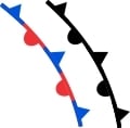
Stationary Front
Like cold and warm fronts, a stationary front also occurs when a body of warm air meets a body of cold air. In this case, neither air mass is powerful enough to dominate and move the other one out of the way. As a result, the front stays in one place and is called a stationary front.
Weather normally associated with these conditions usually consists of long periods of consistent rain that stays in one location.

Occluded Front
A cold front naturally moves faster than a warm front and can eventually catch up with it. When this happens, an occluded front is formed. (It is typically indicated by a purple line with alternating half-circles and triangles.)
A wide variety of weather conditions can form when an occluded front develops, but it is usually associated with clouds and precipitation. A combination of two or more fronts intertwined with each other around a low-pressure system often dominates a weather map.
Isobars
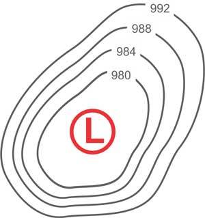
Very often, you will see circular or oval-shaped lines surrounding a high- or low-pressure system. They are followed by a number of similar lines, growing larger and changing in shape as new ones are added.
These lines are called isobars. Each line connects points of equal air (atmospheric) pressure, as it would occur at sea level. (Each pressure reading is adjusted to sea level to remove the influence that height may have on barometric pressure.)
Isobars play an important role in indicating how pressure in the atmosphere changes as it moves away from the center of the pressure system (high or low).
For example, they show you how areas of equal pressure are distributed in relation to the centre of the pressure system. Larger open areas are usually indicated by lines spaced farther apart.
The spacing between the lines also clearly shows you how steep the pressure gradient is, or how quickly the pressure changes. The closer the lines are spaced together, the stronger the wind speed in the area will be.
(Remember, air flows from an area of high pressure to an area of low pressure. The closer the lines are spaced together, the steeper the gradient and the stronger the wind speed.)
Conclusion
As you just discovered, once you know the basic symbols and elements used on a weather map, it looks much less confusing and intimidating.
It will also help you to better understand what the meteorologist means when pointing to different areas on the map to explain how the weather will behave in the future.
Some weather forecasting symbols indicating future weather conditions are sometimes also displayed on the weather map itself. Fortunately, we already covered each of these symbols and what they mean, which you can find in this article.
Until next time, keep your eye on the weather!